
With more than half of 2024 already in the books, it’s time to discuss one of my favorite topics in publishing: cover design. In this article, I’ve taken a look at five excellent fiction covers that have caught my attention over the last few months. Besides being very nice to look at, these covers exemplify some pretty efficient design strategies that help them stand out and draw in readers! Let’s take a look at them.
1. Martyr! by Kaveh Akbar
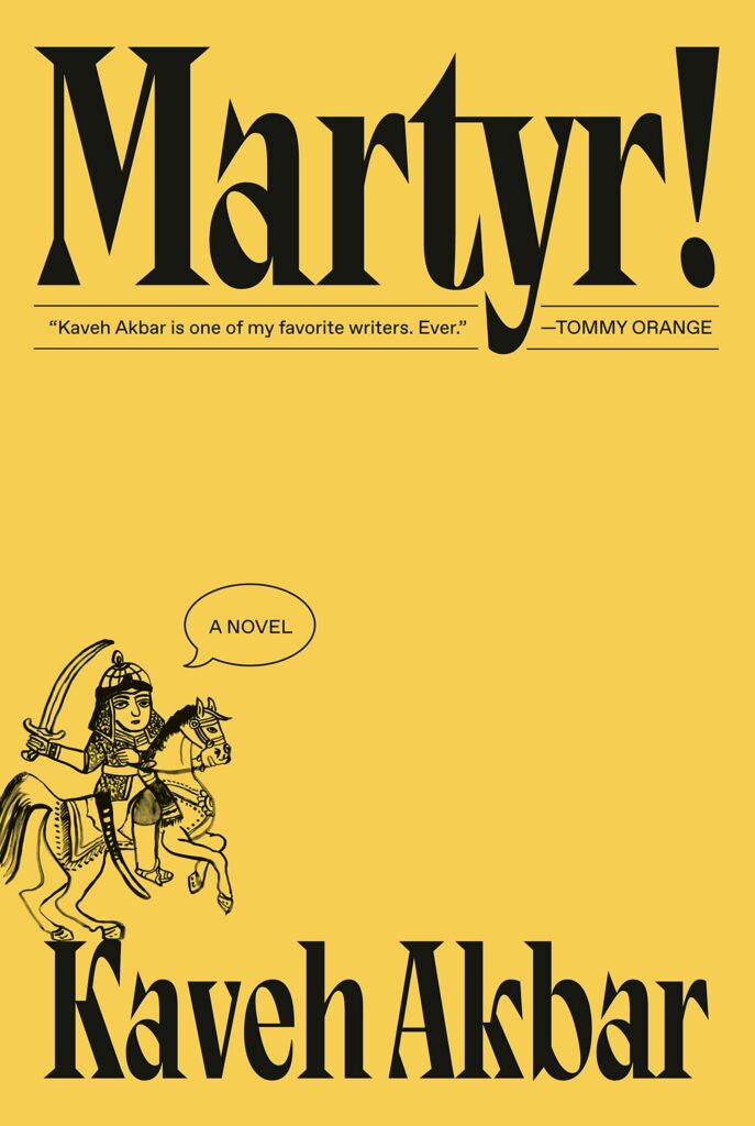
Designer: Linda Huang
Kicking off the year with a bang, this cover for Martyr! by Kaveh Akbar is as striking as it is effective. Defying current novel design trends, what’s great about this cover is that it boldly goes its own way; it doesn’t look like anything else on the market right now, suggesting that the story will be pretty unique too. Here, designer Linda Huang has employed a playfulness that at once calls to mind the simple covers of the 60s and 70s and simultaneously feels modern and fresh.
From the bold typeface (punctuated by the exclamation mark!), to the deadpan “A novel” speech bubble, and the off-center, almost-falling-off-the-page cartoon drawing of the Iranian Angel of Death, this is not the cover most people would expect for a novel about an orphaned son of immigrants. But it is this unexpected quality — together with the humor that has clearly informed all design choices, and which echoes the tragicomic plot of the novel — that makes this such a standout cover. For the people who feel that the current publishing landscape has become saturated with too much of the same thing, this cover is sure to cut through the noise.
2. James by Percival Everett
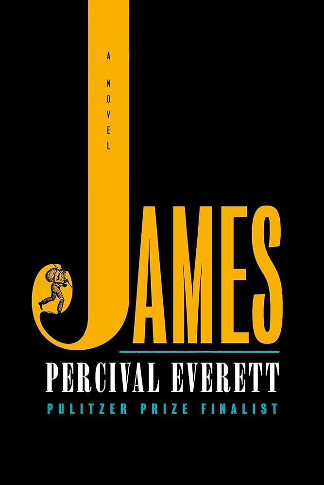
Designer: Emily Mahon
Just like Martyr!, the cover for Percival Everett’s James embraces a bold kind of simplicity, letting the typography do most of the talking by mixing and matching a few different fonts. Perhaps it’s just a coincidence that it uses the same color scheme of mustard yellow and black, but inverts it…
The first and most obvious element on the cover is the long, extended seriph J, inside which the designer Emily Mahon has hidden a sketch of the book’s central character: the enslaved Jim from The Adventures of Huckleberry Finn. Just like Martyr!, there’s a playfulness here — a game for the viewer to find the subtle details, just like how the readers will have to parse out where James and Huckleberry Finn overlap and differ.
But then Mahon follows this rounded serif font with sans serif lettering, as well as an Onyx-like font that condenses and maximizes the space, while giving the whole cover a retro feel. All taken together, this creates nice clean lines and a satisfying symmetry, ultimately producing a more serious tone than the cover of Martyr! — fitting for a “Pulitzer Prize Finalist.” Finishing off with some contrasting accent colors in turquoise that create separation, this is a simple yet thoughtful cover that does the contents of the book great justice.
3. River East, River West by Aube Rey Lescure
Designer: Jeanne Lee Reina
What immediately drew me to the cover of River East, River West by Aube Rey Lescure was the color scheme. But when you look closer, it’s not just a beautiful cover, but a truly well-designed, fun cover with plenty of details to keep you intrigued.
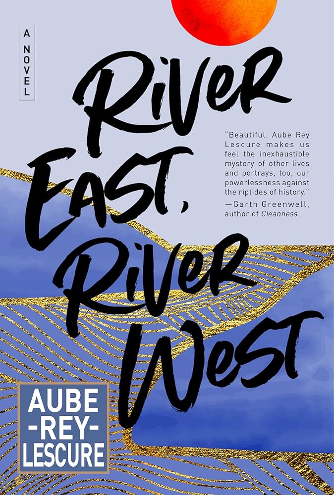
Unlike both Martyr! and James, this takes a more maximalist approach, with a purple and lilac base, gold foil, a loose and easy handwritten font style, and an art-deco-esque square for the author name. The font creates a fluid feeling, referring us back to the motif of the river, while a bright orange sun at the top of the cover creates contrast — and thus balance — in an otherwise pretty monochrome cover.
It also loosely follows the design principle of sixes, which works for any genre: the eye tends to process images from the top of the page (where the sun draws our eye) and then travel in an arch towards the left (following the curve of the title) before skimming the bottom (where we catch the author name) and moving back up again, like the shape of the number 6. It’s beautiful and functional. Despite having lots of things going on at once, it doesn’t feel cluttered or messy.
4. A Cold Night For Alligators by Viggy Parr Hampton
Designer: Nuno Moreira
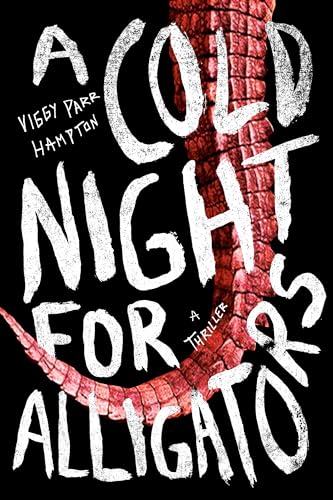
Switching gears a bit, this dark, menacing cover by Nuno Moreira for Viggy Parr Hampton’s A Cold Night For Alligators is all about establishing mood — and it does so exceptionally well.
Nothing screams thriller quite like a black background, a blood-red scaly reptile, and a creepy graffiti font: a perfect mix for its target market. Following a CDC epidemiologist who goes rogue to tackle an outbreak and ends up in an abandoned theme park where dark forces stir, this cover does a great job of setting expectations for its readers: you’re in for a pulse-raising time. A strategic and irresistable approach to design!
5. Intermezzo by Sally Rooney
Designers: June Park and Rodrigo Corral
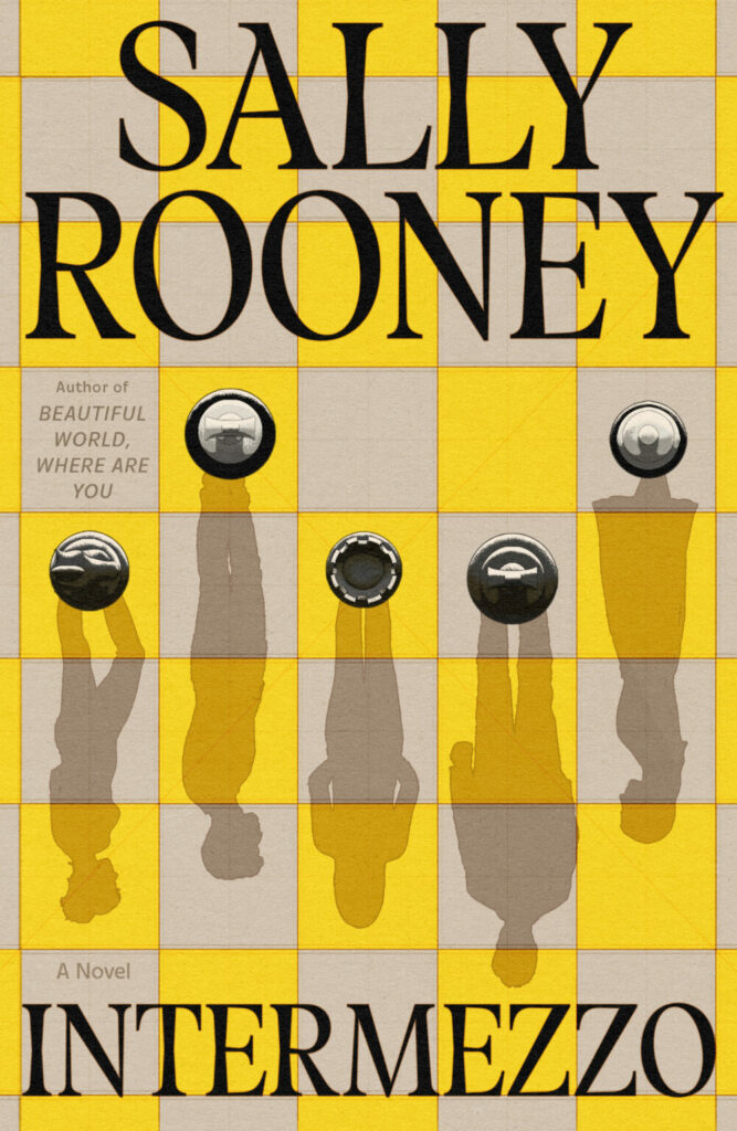
When you’re assigned to put together a cover for one of the most anticipated books of the year, the pressure is definitely on. With Intermezzo by Sally Rooney, cover designers Park and Corral have delivered: it’s a clever and alluring book cover that at once stays true to the plot of the book, and simultaneously moves Sally Rooney’s authorship and branding in a slightly new direction (though hints back at fan favorites through the color scheme).
Honestly, I wouldn’t say that I’m the biggest fan of this cover on a purely aesthetic basis, but nonetheless I think it’s an excellent example of great cover design. For a novel that partly centers around a competitive chess player, the motif of the chess pawns is a pretty obvious one, so the challenge lies in creating something fresh without resorting to clichés (think Breaking Dawn in the Twilight series, for instance).
What we’ve landed on is a chess board in mustard yellow (the color of the season!), with four pawns to represent the main characters (themselves pawns in this great game of life) and a bold slab serif font. This takes a step away from Rooney’s earlier covers and work, subtly hinting to the reader that they should prepare for something slightly different this time around.
There you have it: my five favorite covers of the year so far, and why they’re all brilliant in their own ways. There are so many other beautiful, clever, and striking book covers out there, but no matter what your personal taste is, these covers represent thoughtful and purposeful design which both catches the eye and serves as the perfect mood-setter for the reading experience.
Linnea Gradin is a writer for Reedsy — a website that connects authors with freelancing publishing professionals and gives advice on everything writing and publishing related. When Linnea is not reading, she can be found dribbling on the football pitch, dabbling in foreign languages, or exploring the local cuisine of whatever country she happens to be in at the time.
More great book cover design examples from 2024
The above examples are fun and creative, for literary fiction – but we also like to focus on bestselling commercial fiction designs, which aren’t always the same. Here are some of my favorite 2024 book cover designs without comment – I’ll also post these to my Pinterest board of book cover design inspiration
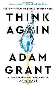
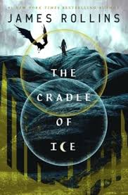
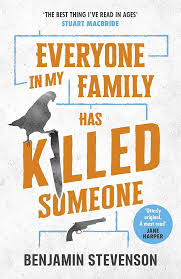
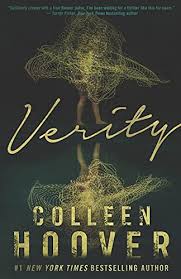
For YA fantasy covers, they’re using more pastels and illustrations. Nonfiction and thrillers though, are classic: simple text and obvious covers. What do you think of these?