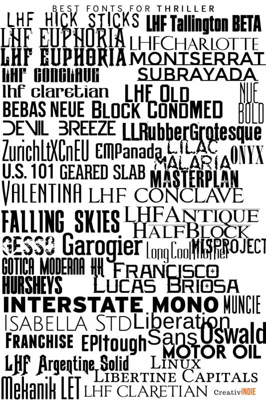
Using the right fonts on your book cover helps tell the reader what genre your book fits into and elicits an emotional response.
You want it to look great, but also be appropriate, fit in well with the cover design, and (probably) be just a little more interesting than a standard font.
So I’ve put together some cheat-sheets of the best fonts to use for your book cover, divided by genre.
In general, stick to 1 “fancy” or decorative font, and keep the other fonts very simple. You don’t want them to compete.
Also – the MOST important thing about your book cover (for fiction at least) is the picture – so don’t distract or cover it up with the text. Let the picture do its work, make the text more subtle, by blending in with the image as one art piece.
For non-fiction, the most important thing is the text, mostly the subtitle. Use simple serif or sans-serif fonts.
To use these: find the font you like and Google it. (The name of each font is written in that font).
Some are free, some aren’t.
There are LOTS more, but this is a good start.
Best fonts for book cover design
Check out this updated list of best fonts for fantasy and scifi!
Here’s another big list of free fonts.


